twoColumn twoRight handbook
Advanced Page Features
Accordion (FAQ)
An accordion is a collapsible set of question and answers or headlines and collapsed or hidden text. This is most frequently use as a Frequently Asked Questions (FAQ) section. You can make an accordion a page or a tier in the advanced layout.
The accordion (FAQ) is set up similar to other pages/tiers. Examples of an accordion (FAQ) are on the Advance Layout page and in the Web Training horizontal menu under Examples.
Alert Feed
An Alert Feed lets editors create an "alert" that can appear at the top of the web page, underneath the banner image or anywhere a normal text field can be added. Alert Feeds can also be setup to publish and expire on their own at certain dates and times. For more information on how to set up an Alert Feed on your web page, contact webmaster@unf.edu.
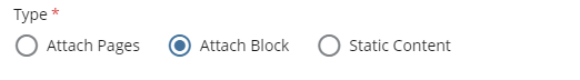
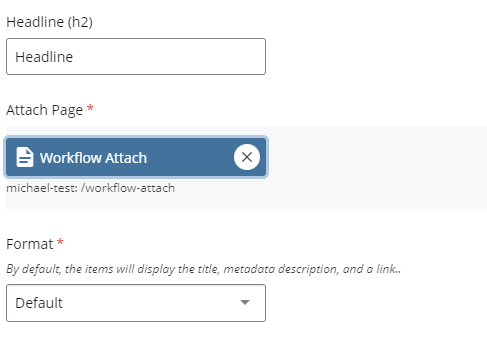
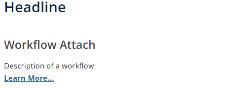
Attach Pages / Blocks
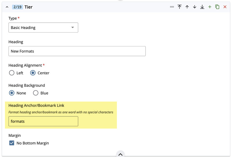
Basic Heading with Anchor Link
We have added to the Basic Heading Tier an anchor or bookmark link to the bottom of the panel highlighted in yellow below. It is under Heading Anchor/Bookmark Link. Add your anchor name here as one word with no special characters.
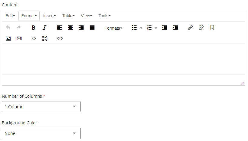
Columns
Columns is one of the most versatile tiers in Cascade. It can be used to highlight important text or links with icons or images. You can achieve different looks by using Number of Columns, Background Color, Block Color, No Bottom Margin and No Gutters.
- Background Color is the overall color.
- Block Color is the color within content field.
- No Bottom Margin will delete the white space between tiers.
- No Gutters will remove the space between the columns.
Special Slash Columns
A special type of column can be selected from the Number of Columns dropdown called Special Slash Columns. This is a special method of creating a callout style column that is 3/4 Osprey Blue and 1/4 UNF Aqua Blue (Cyan). An example of this feature can be found in the columns section of the Advanced Layout page.
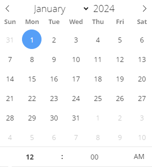
Countdown Timer
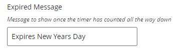
A countdown timer allows you to showcase how many days, hours and minutes are left until the start of an event. The countdown timer also lets you set a message for after the timer has finished counting, such as "Happening Now!" or any other verbiage you'd like to use.
- Select a date and time from the Countdown Timer calendar selector for the timer to count to.
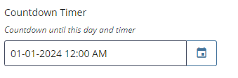
- Type your message to display after the timer has counted down in the Expired Message text box.
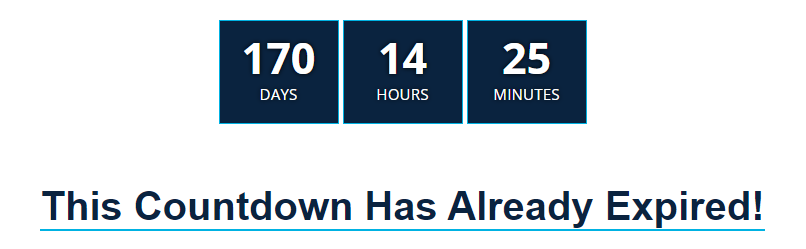
Here is an example of a timer set to expire in the future looks like. Below it is an example of what an expired timer could look like.
Data Integration
This tier is only used by Web & Digital and ITS.
News / Events RSS
News / Events RSS Tier allows you to have a continuously updated calendar of events and newsroom stories.
There are a few options for this tier. Under the FlexSplit section, Newsroom and Events Type, there is a drop-down with List and News Blocks.
- List will make a two column design of the Newsroom feed and the Events Calendar or a Photo and the Events Calendar. When you choose List you will have two sections Left Side and Right Side.
- The Left Side is where you will find the Type (News List, Photo or Embed). If you choose List under Type you will get a Newsroom feed of the latest stories. The Headline is a link to the full article and a small synopsis of the article. Underneath Type, you have an optional Headline and a Headline Button. The Headline Button will add a button link directly under your headline.
- Data Source should be Dynamic.
- News Category will give you the option for specific categories such as Community, Campus News or Colleges.
- Number of Items is how many stories you want to show.
- The Right Side is for the Calendar. Headline Button gives you the option to link to a page such as, the main calendar. Feed Type will be Localist Feed. There are two feeds from Localist that you may choose, Academic or Featured. Please contact, Web and Digital Services for the Localist API Feed. Pick the Number of Items between three and five items to view.
- News Blocks will pull the latest Newsroom stories with images, headlines and a synopsis of the story into a three column design. You will be able to specify your Background Color, Block Color, News Category and Number of Items displayed. This option on our Advanced Layout.
Photo Parallax
Photo Parallax is a visual effect where the background image appears to stay still while the foreground shifts horizontally. Finding an image that will look good as a parallax can be tricky. Please contact webmaster@unf.edu for assistance.
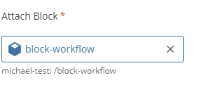
Shared Advanced Block
Shared Advanced Block Tier attaches an Advanced Block to your page. The Advanced Block is under Block Types when you Add Content. The Tier Types are the same for Advanced Page and Advanced Block.
The advantage of using the Shared Advanced Block is to be able to put the same information on several pages and edit the information in one place.
Spacer
Spacers allow the user to create a blank tier that can add extra space between multiple tiers. When editing your page you can add a "Spacer" tier and choose whether you want that spacer to have a background color or be white space. You can also choose the No Margin checkbox to make spacers with color have no white space underneath the color.